Introduction
Steve Meadwell has spent the better part of two decades working at the intersection of education, charity and community development. Through his work with the Centre for Social Justice and years of front-line involvement across Loughborough, he has seen the same problem play out repeatedly: individuals and organisations doing valuable work in isolation, with no effective way to connect effort, share resource or avoid duplication. The people, the intent and the expertise were already there. What was missing was coordination.
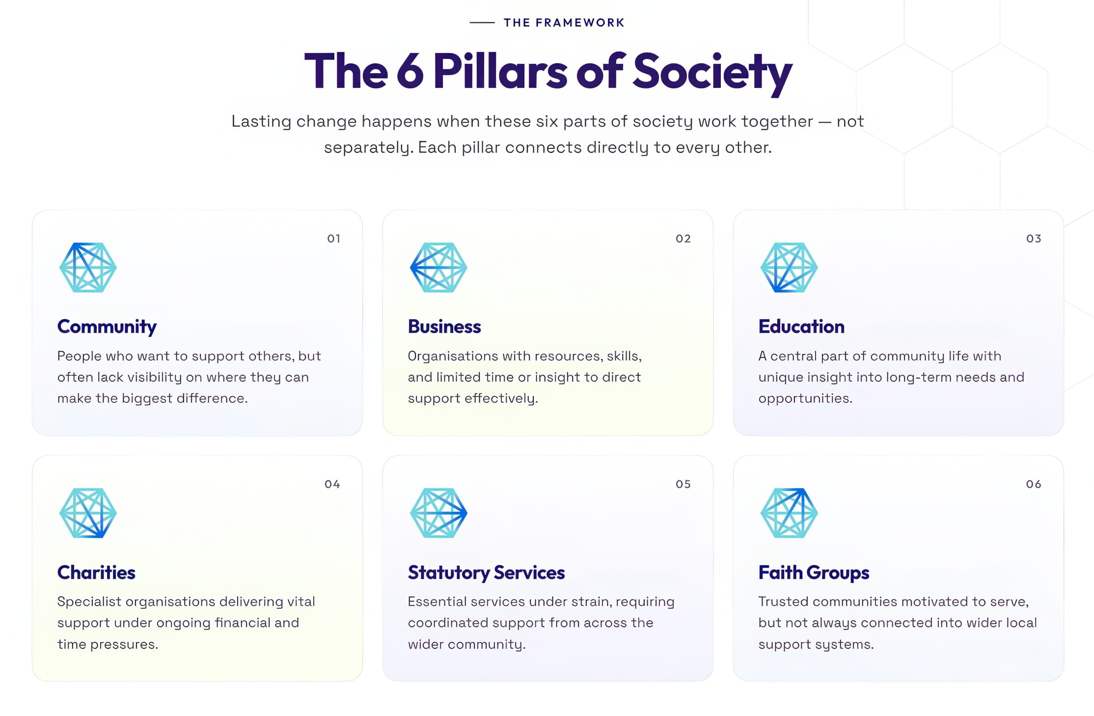
That insight became Hexagon – a framework built around six key pillars of society (community, business, education, charities, statutory services and faith groups) each one capable of contributing something distinct, and collectively capable of delivering something far greater when working together. Steve had been developing and refining the concept for years, carrying it into conversations with people across all six of those pillars as part of his day-to-day work.
The Challenge
Hexagon existed as an idea and as a conversation. Steve knew the concept had real traction with the people he was talking to, and he could see the practical next steps clearly: workshops bringing leaders from across the six pillars together, a framework other organisations could adopt and replicate, and eventually a national model built from a strong local foundation. But without a visual identity, a website or any supporting materials, there was nowhere to point people. The concept had no home.
That mattered practically as much as it did perceptually. Every conversation Steve had was carrying the full weight of the idea on its own, with nothing to back it up afterwards. He needed something real and credible he could hand someone – something that would allow those conversations to continue, build a community of like-minded people and organisations, and start to give Hexagon the presence it needed to grow.
The Solution
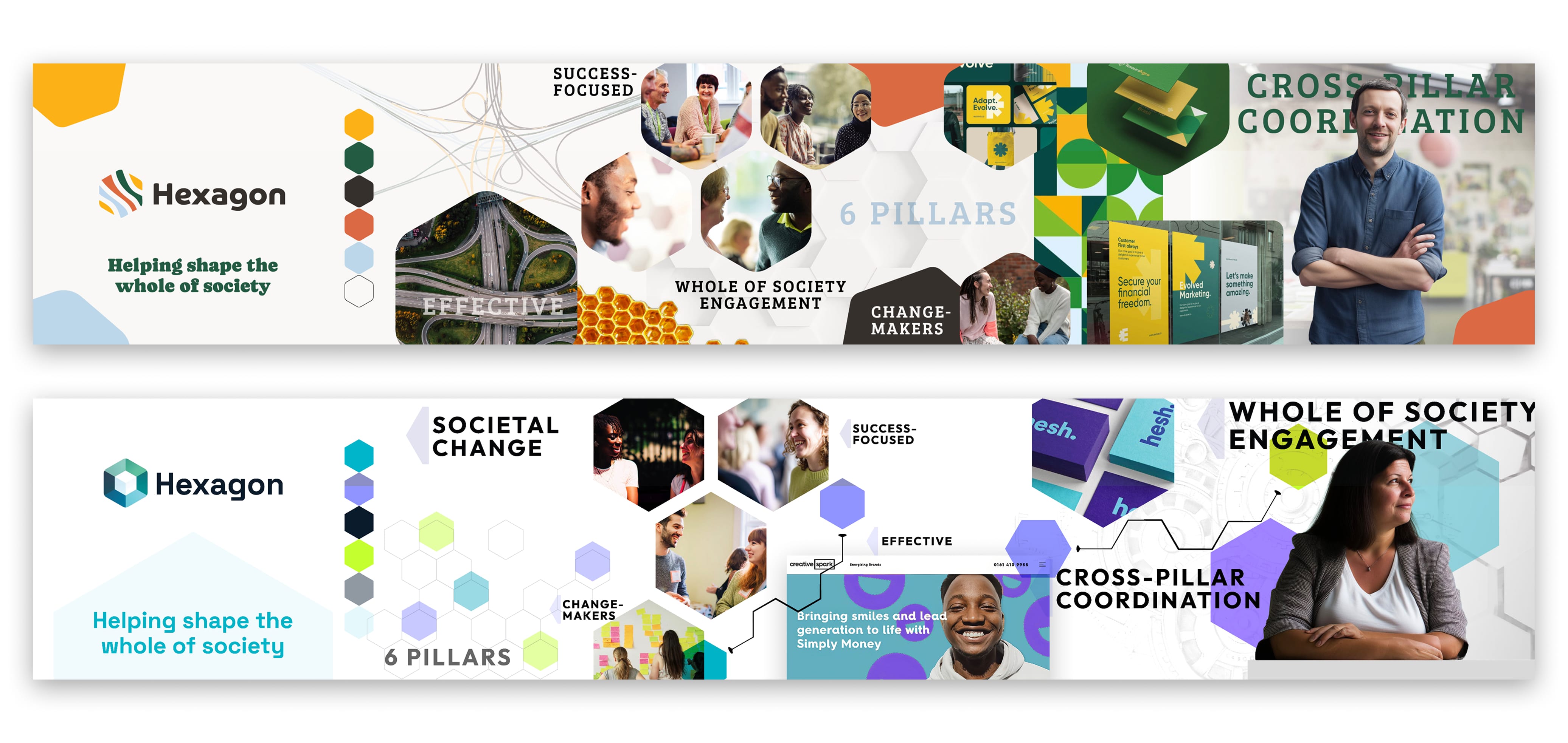
The design challenge was to express the core idea of the Hexagon model visually – interconnectedness, coordination and the joining of different parts into something whole. That became the organising principle for every element of the identity system.
- Designed a geometric logo mark based on a hexagon in which every point connects to all five others via graduating lines, with one point highlighted to show each pillar's relationship to the whole
- Developed a rotational device at 72° intervals so that the same mark could represent each of the six pillars individually while always pointing back to the network it belongs to
- Set the wordmark in Outfit, a bold, clean sans serif that reads with clarity and confidence
- Paired it with Space Grotesque for body typography, giving the system a modern, open voice throughout
- Built a palette of purples, blues and turquoise – high-saturation, vibrant colours that feel dynamic and alive without a dull note in the system
- Created a honeycomb pattern device using interconnected hexagons as a background texture and layout element, reinforcing the network concept across all applications
- Designed a directional path device that traces the contours of the honeycomb grid to suggest movement and connection across the network
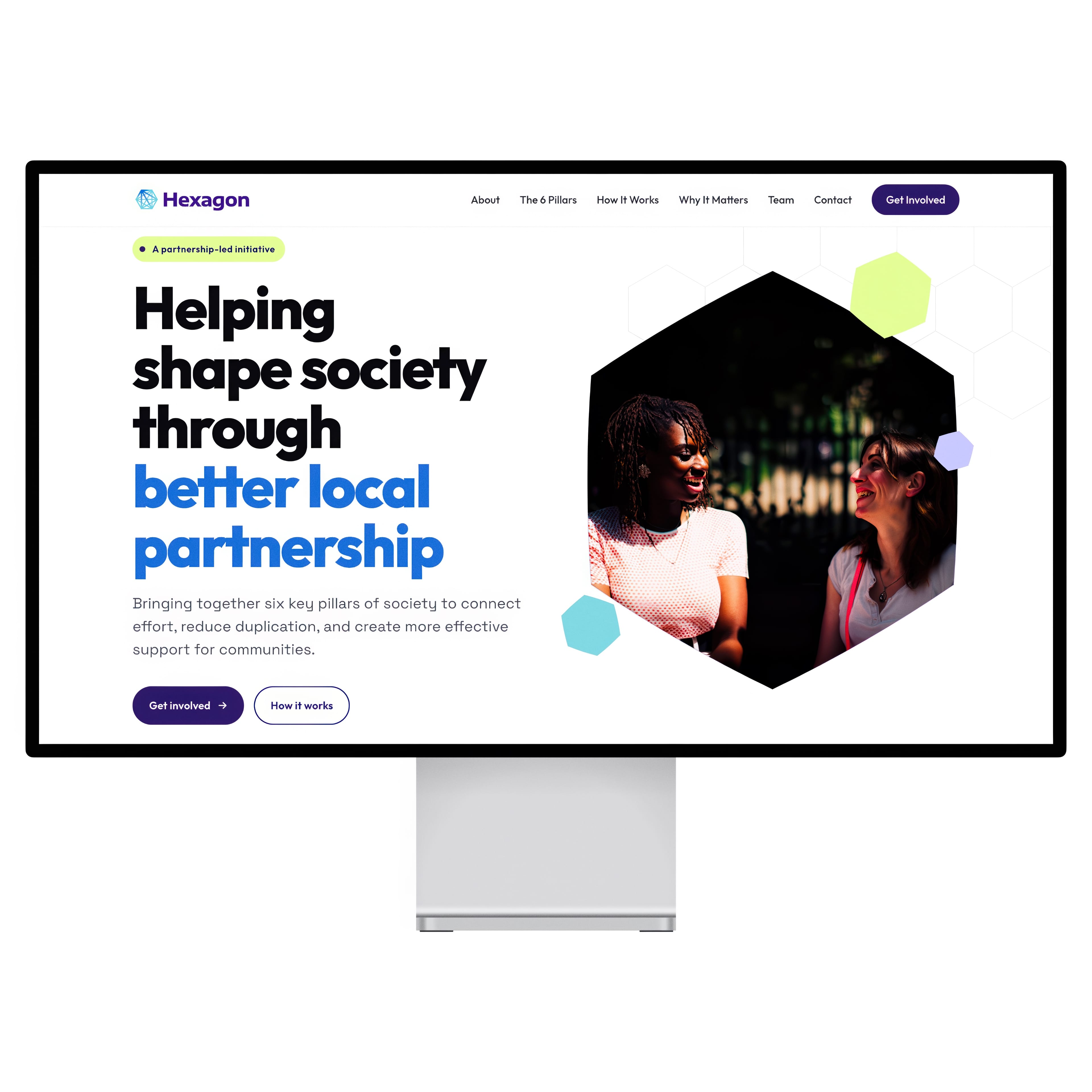
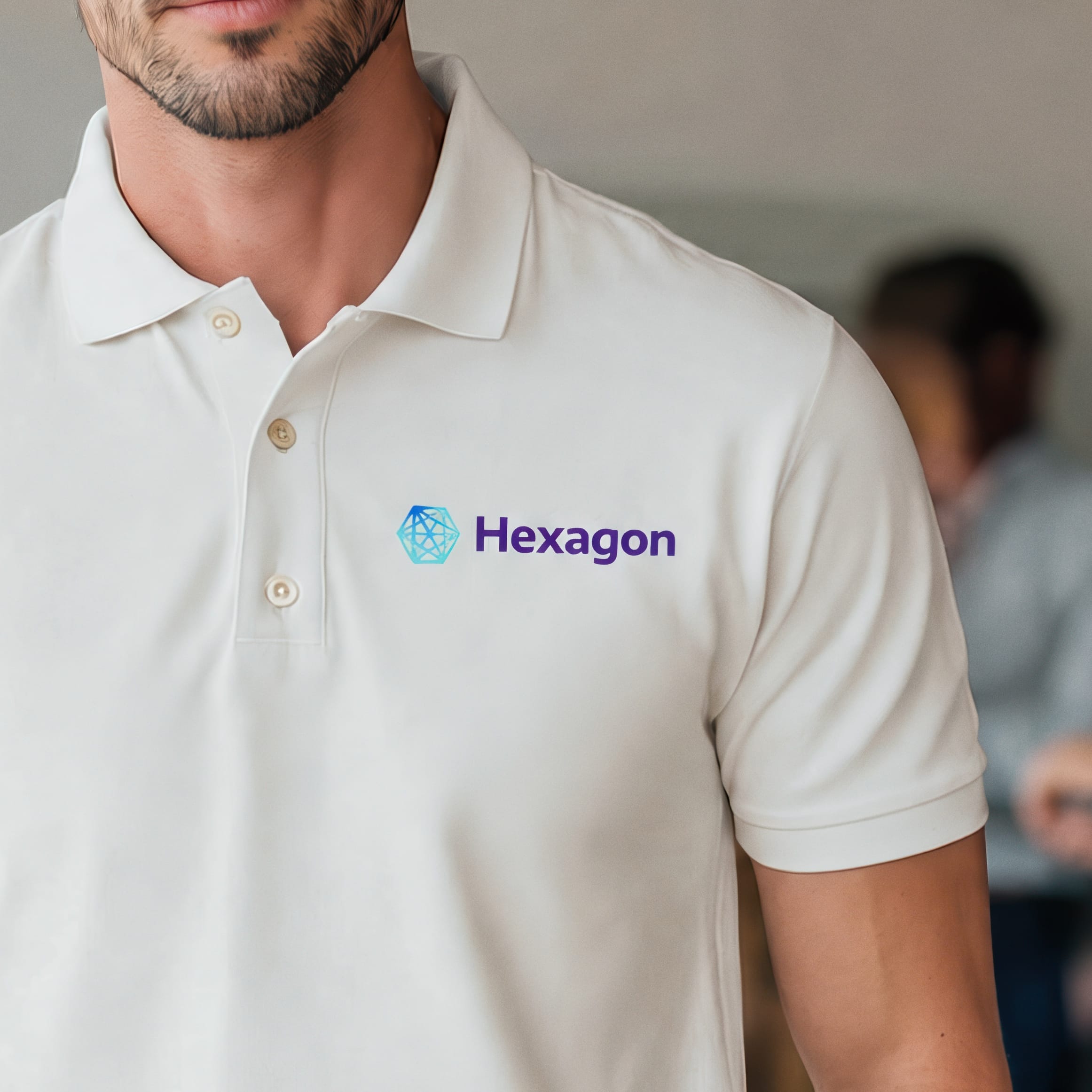
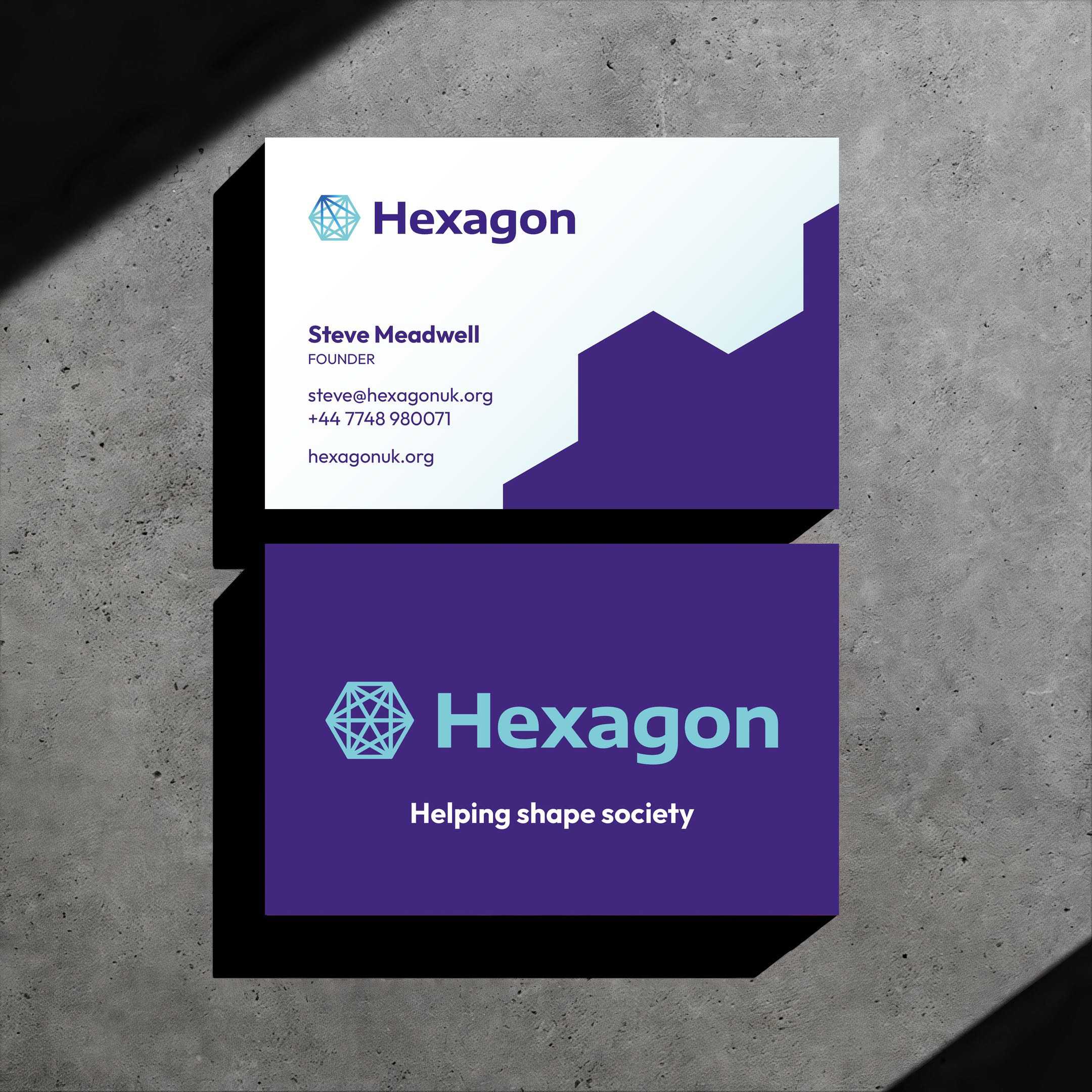
- Extended the identity into website UI design, delivering a fully considered digital presence alongside business stationery to get Steve into the world
The Impact
Before the project, Hexagon was a concept carried entirely in conversation. Steve had been building the idea for years, but with no visual identity to anchor it, every interaction depended on his ability to communicate the vision in the moment, with nothing to leave behind.
Now there is something real to build on. The brand gives Hexagon a credible presence – a website to point people to, stationery to hand across a table, and a visual language coherent enough to carry the organisation into its next phase. The immediate next step is workshops bringing together leaders from across the six pillars, and the identity is ready to support that: presentation materials, banners and whatever else those conversations need are a natural extension of the system already in place.
For an organisation that is still forming, that tangibility matters enormously. Hexagon is no longer just an idea – it is a brand with a home, and that changes what Steve is able to do with it.
Why it works
A brand does not need to wait for an organisation to be fully formed before it does useful work. For early-stage ideas with genuine substance, a clear visual identity is not a finishing touch – it is the thing that makes the concept real enough to build on.